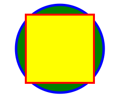
Here's a simple example. To render output like this:
Use the following code:
import Svg, {
  Circle,
  Ellipse,
  G,
  Text,
  TSpan,
  TextPath,
  Path,
  Polygon,
  Polyline,
  Line,
  Rect,
  Use,
  Image,
  Symbol,
  Defs,
  LinearGradient,
  RadialGradient,
  Stop,
  ClipPath,
  Pattern,
  Mask,
} from 'react-native-svg';

import React from 'react';
import { View, StyleSheet } from 'react-native';

export default class SvgExample extends React.Component {
  render() {
    return (
      <View
        style={[
          StyleSheet.absoluteFill,
          { alignItems: 'center', justifyContent: 'center' },
        ]}>
        <Svg height="50%" width="50%" viewBox="0 0 100 100">
          <Circle
            cx="50"
            cy="50"
            r="45"
            stroke="blue"
            strokeWidth="2.5"
            fill="green"
          />
          <Rect
            x="15"
            y="15"
            width="70"
            height="70"
            stroke="red"
            strokeWidth="2"
            fill="yellow"
          />
        </Svg>
      </View>
    );
  }
}import * as React from 'react';
import { SvgUri } from 'react-native-svg';
export default () => (
<SvgUri
width="100%"
height="100%"
uri="http://thenewcode.com/assets/images/thumbnails/homer-simpson.svg"
/>
);If remote SVG file contains CSS in <style> element, use SvgCssUri:
import * as React from 'react';
import { ActivityIndicator, View, StyleSheet } from 'react-native';
import { SvgCssUri } from 'react-native-svg/css';
export default function TestComponent() {
  const [loading, setLoading] = React.useState(true);
  const onError = (e: Error) => {
    console.log(e.message);
    setLoading(false);
  };
  const onLoad = () => {
    console.log('Svg loaded!');
    setLoading(false);
  };
  return (
    <>
      <SvgCssUri
        width="100"
        height="100"
        uri="https://dev.w3.org/SVG/tools/svgweb/samples/svg-files/ruby.svg"
        onError={onError}
        onLoad={onLoad}
      />
      {loading && <ActivityIndicator size="large" color="#0000ff" />}
    </>
  );
}Both SvgUri and SvgCssUri log errors to the console, but otherwise ignore them.
You can set property onError if you want to handle errors such as resource not
existing in a different way and fallback if you want to render another component instead in such case.
import * as React from 'react';
import { SvgUri } from 'react-native-svg/css';
import { SvgFallback } from './components/SvgFallback';

export default () => {
  const [uri, setUri] = React.useState(
    'https://dev.w3.org/SVG/tools/svgweb/samples/svg-files/not_existing.svg'
  );
  return (
    <SvgUri
      onError={() =>
        setUri('https://dev.w3.org/SVG/tools/svgweb/samples/svg-files/ruby.svg')
      }
      width="100%"
      height="100%"
      uri={uri}
      fallback={<SvgFallback />}
    />
  );
};No additional steps are required when using Metro bundler.
If you are using the Webpack bundler, the following steps are needed:
- Install
@react-native/assets-registry/registryas a project dependency. - Ensure that you have the proper configuration to parse flow files from
@react-native/assets-registry/registry. - Configure the Webpack
module -> rulessection and include an important rule fornode_modules/@react-native/assets-registry/registry.
webpack.config.js
const babelLoaderConfiguration = {
 include: [
   path.resolve(
     appDirectory,
     // Important!
     'node_modules/@react-native/assets-registry/registry',
   ),
 ],
 ...
};

module.exports = {
 ...config,
 module: {
     rules: [babelLoaderConfiguration],
   },
};
For more details on the complete Webpack configuration, you can refer to this documentation on how to set up a webpack.config file for React Native Web.
Try react-native-svg-transformer to get compile time conversion and cached transformations. https://github.com/kristerkari/react-native-svg-transformer#installation-and-configuration https://github.com/kristerkari/react-native-svg-transformer#for-react-native-v057-or-newer--expo-sdk-v3100-or-newer
metro.config.js for react-native >= 0.72
const { getDefaultConfig, mergeConfig } = require('@react-native/metro-config');

const defaultConfig = getDefaultConfig(__dirname);
const { assetExts, sourceExts } = defaultConfig.resolver;

/**
 * Metro configuration
 * https://facebook.github.io/metro/docs/configuration
 *
 * @type {import('metro-config').MetroConfig}
 */
const config = {
  transformer: {
    babelTransformerPath: require.resolve('react-native-svg-transformer'),
  },
  resolver: {
    assetExts: assetExts.filter((ext) => ext !== 'svg'),
    sourceExts: [...sourceExts, 'svg'],
  },
};

module.exports = mergeConfig(defaultConfig, config);
metro.config.js for react-native < 0.72
const { getDefaultConfig } = require('metro-config');

module.exports = (async () => {
  const {
    resolver: { sourceExts, assetExts },
  } = await getDefaultConfig();
  return {
    transformer: {
      babelTransformerPath: require.resolve('react-native-svg-transformer'),
    },
    resolver: {
      assetExts: assetExts.filter((ext) => ext !== 'svg'),
      sourceExts: [...sourceExts, 'svg'],
    },
  };
})();
Import your .svg file inside a React component:
import Logo from './logo.svg';You can then use your image as a component:
<Logo width={120} height={40} />Alternatively, you can use SvgXml with babel-plugin-inline-import, but with transforms done at run-time.
.babelrc
{
  "presets": ["module:metro-react-native-babel-preset"],
  "plugins": [
    [
      "babel-plugin-inline-import",
      {
        "extensions": [".svg"]
      }
    ]
  ]
}
App.js
import * as React from 'react';
import { SvgXml } from 'react-native-svg';
import testSvg from './test.svg';
export default () => <SvgXml width="200" height="200" xml={testSvg} />;import * as React from 'react';
import { SvgXml } from 'react-native-svg';
const xml = `
<svg width="32" height="32" viewBox="0 0 32 32">
<path
fill-rule="evenodd"
clip-rule="evenodd"
fill="url(#gradient)"
d="M4 0C1.79086 0 0 1.79086 0 4V28C0 30.2091 1.79086 32 4 32H28C30.2091 32 32 30.2091 32 28V4C32 1.79086 30.2091 0 28 0H4ZM17 6C17 5.44772 17.4477 5 18 5H20C20.5523 5 21 5.44772 21 6V25C21 25.5523 20.5523 26 20 26H18C17.4477 26 17 25.5523 17 25V6ZM12 11C11.4477 11 11 11.4477 11 12V25C11 25.5523 11.4477 26 12 26H14C14.5523 26 15 25.5523 15 25V12C15 11.4477 14.5523 11 14 11H12ZM6 18C5.44772 18 5 18.4477 5 19V25C5 25.5523 5.44772 26 6 26H8C8.55228 26 9 25.5523 9 25V19C9 18.4477 8.55228 18 8 18H6ZM24 14C23.4477 14 23 14.4477 23 15V25C23 25.5523 23.4477 26 24 26H26C26.5523 26 27 25.5523 27 25V15C27 14.4477 26.5523 14 26 14H24Z"
/>
<defs>
<linearGradient
id="gradient"
x1="0"
y1="0"
x2="8.46631"
y2="37.3364"
gradient-units="userSpaceOnUse">
<stop offset="0" stop-color="#FEA267" />
<stop offset="1" stop-color="#E75A4C" />
</linearGradient>
</defs>
</svg>
`;
export default () => <SvgXml xml={xml} width="100%" height="100%" />;If xml string contains CSS in <style> element, use SvgCss:
import * as React from 'react';
import { SvgCss } from 'react-native-svg';

const xml = `
  <svg width="32" height="32" viewBox="0 0 32 32">
    <style>
      .red {
        fill: #ff0000;
      }
    </style>
    <rect class="red" x="0" y="0" width="32" height="32" />
  </svg>
`;

export default () => <SvgCss xml={xml} width="100%" height="100%" />;| Name | Default | Description |
|---|---|---|
| fill | '#000' | The fill prop refers to the color inside the shape. |
| fillOpacity | 1 | This prop specifies the opacity of the color or the content the current object is filled with. |
| fillRule | nonzero | The fillRule prop determines what side of a path is inside a shape, which determines how fill will paint the shape, can be nonzero or evenodd |
| stroke | 'none' | The stroke prop controls how the outline of a shape appears. |
| strokeWidth | 1 | The strokeWidth prop specifies the width of the outline on the current object. |
| strokeOpacity | 1 | The strokeOpacity prop specifies the opacity of the outline on the current object. |
| strokeLinecap | 'square' | The strokeLinecap prop specifies the shape to be used at the end of open subpaths when they are stroked. Can be either 'butt', 'square' or 'round'. |
| strokeLinejoin | 'miter' | The strokeLinejoin prop specifies the shape to be used at the corners of paths or basic shapes when they are stroked. Can be either 'miter', 'bevel' or 'round'. |
| strokeDasharray | [] | The strokeDasharray prop controls the pattern of dashes and gaps used to stroke paths. |
| strokeDashoffset | null | The strokeDashoffset prop specifies the distance into the dash pattern to start the dash. |
| x | 0 | Translate distance on x-axis. |
| y | 0 | Translate distance on y-axis. |
| rotation | 0 | Rotation degree value on the current object. |
| scale | 1 | Scale value on the current object. |
| origin | 0, 0 | Transform origin coordinates for the current object. |
| originX | 0 | Transform originX coordinates for the current object. |
| originY | 0 | Transform originY coordinates for the current object. |
<Svg height="100" width="100">
  <Rect x="0" y="0" width="100" height="100" fill="black" />
  <Circle cx="50" cy="50" r="30" fill="yellow" />
  <Circle cx="40" cy="40" r="4" fill="black" />
  <Circle cx="60" cy="40" r="4" fill="black" />
  <Path d="M 40 60 A 10 10 0 0 0 60 60" stroke="black" />
</Svg>
Colors set in the Svg element are inherited by its children:
<Svg
  width="130"
  height="130"
  fill="blue"
  stroke="red"
  color="green"
  viewBox="-16 -16 544 544">
  <Path
    d="M318.37,85.45L422.53,190.11,158.89,455,54.79,350.38ZM501.56,60.2L455.11,13.53a45.93,45.93,0,0,0-65.11,0L345.51,58.24,449.66,162.9l51.9-52.15A35.8,35.8,0,0,0,501.56,60.2ZM0.29,497.49a11.88,11.88,0,0,0,14.34,14.17l116.06-28.28L26.59,378.72Z"
    strokeWidth="32"
  />
  <Path d="M0,0L512,512" stroke="currentColor" strokeWidth="32" />
</Svg>
Code explanation:
- The fill prop defines the color inside the object.
- The stroke prop defines the color of the line drawn around the object.
- The color prop is a bit special in the sense that it won't color anything by itself, but define a kind of color variable that can be used by children elements. In this example we're defining a "green" color in the Svg element and using it in the second Path element via stroke="currentColor". The "currentColor" is what refers to that "green" value, and it can be used in other props that accept colors too, e.g. fill="currentColor".
The element is used to create a rectangle and variations of a rectangle shape:
<Svg width="200" height="60">
  <Rect
    x="25"
    y="5"
    width="150"
    height="50"
    fill="rgb(0,0,255)"
    strokeWidth="3"
    stroke="rgb(0,0,0)"
  />
</Svg>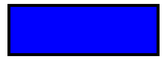
Code explanation:
- The width and height props of the element define the height and the width of the rectangle.
- The x prop defines the left position of the rectangle (e.g. x="25" places the rectangle 25 px from the left margin).
- The y prop defines the top position of the rectangle (e.g. y="5" places the rectangle 5 px from the top margin).
The element is used to create a circle:
<Svg height="100" width="100">
  <Circle cx="50" cy="50" r="50" fill="pink" />
</Svg>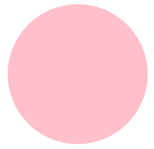
Code explanation:
- The cx and cy props define the x and y coordinates of the center of the circle. If cx and cy are omitted, the circle's center is set to (0,0)
- The r prop defines the radius of the circle
The element is used to create an ellipse.
An ellipse is closely related to a circle. The difference is that an ellipse has an x and a y radius that differs from each other, while a circle has equal x and y radius.
<Svg height="100" width="110">
  <Ellipse
    cx="55"
    cy="55"
    rx="50"
    ry="30"
    stroke="purple"
    strokeWidth="2"
    fill="yellow"
  />
</Svg>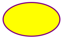
Code explanation:
- The cx prop defines the x coordinate of the center of the ellipse
- The cy prop defines the y coordinate of the center of the ellipse
- The rx prop defines the horizontal radius
- The ry prop defines the vertical radius
The element is an SVG basic shape, used to create a line connecting two points.
<Svg height="100" width="100">
  <Line x1="0" y1="0" x2="100" y2="100" stroke="red" strokeWidth="2" />
</Svg>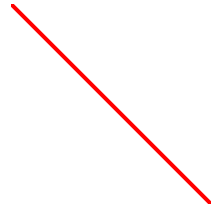
Code explanation:
- The x1 prop defines the start of the line on the x-axis.
- The y1 prop defines the start of the line on the y-axis.
- The x2 prop defines the end of the line on the x-axis.
- The y2 prop defines the end of the line on the y-axis.
The element is used to create a graphic that contains at least three sides. Polygons are made of straight lines, and the shape is "closed" (all the lines connect up).
<Svg height="100" width="100">
  <Polygon
    points="40,5 70,80 25,95"
    fill="lime"
    stroke="purple"
    strokeWidth="1"
  />
</Svg>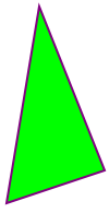
Code explanation:
- The points prop defines the x and y coordinates for each corner of the polygon
The element is used to create any shape that consists of only straight lines:
<Svg height="100" width="100">
  <Polyline
    points="10,10 20,12 30,20 40,60 60,70 95,90"
    fill="none"
    stroke="black"
    strokeWidth="3"
  />
</Svg>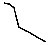
Code explanation:
- The points prop defines the x and y coordinates for each point of the polyline
The element is used to define a path.
The following commands are available for path data:
- M = moveto
- L = lineto
- H = horizontal lineto
- V = vertical lineto
- C = curveto
- S = smooth curveto
- Q = quadratic Bézier curve
- T = smooth quadratic Bézier curveto
- A = elliptical Arc
- Z = closepath
Note: All of the commands above can also be expressed with lower letters. Capital letters means absolutely positioned, lower cases means relatively positioned. See Path document of SVG to know parameters for each command.
<Svg height="100" width="100">
  <Path
    d="M25 10 L98 65 L70 25 L16 77 L11 30 L0 4 L90 50 L50 10 L11 22 L77 95 L20 25"
    fill="none"
    stroke="red"
  />
</Svg>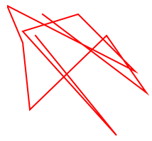
The element is used to define text.
<Svg height="60" width="200">
  <Text
    fill="none"
    stroke="purple"
    fontSize="20"
    fontWeight="bold"
    x="100"
    y="20"
    textAnchor="middle">
    STROKED TEXT
  </Text>
</Svg>
The element is used to draw multiple lines of text in SVG. Rather than having to position each line of text absolutely, the element makes it possible to position a line of text relatively to the previous line of text.
<Svg height="160" width="200">
  <Text y="20" dx="5 5">
    <TSpan x="10">tspan line 1</TSpan>
    <TSpan x="10" dy="15">
      tspan line 2
    </TSpan>
    <TSpan x="10" dx="10" dy="15">
      tspan line 3
    </TSpan>
  </Text>
  <Text x="10" y="60" fill="red" fontSize="14">
    <TSpan dy="5 10 20">12345</TSpan>
    <TSpan fill="blue" dy="15" dx="0 5 5">
      <TSpan>6</TSpan>
      <TSpan>7</TSpan>
    </TSpan>
    <TSpan dx="0 10 20" dy="0 20" fontWeight="bold" fontSize="12">
      89a
    </TSpan>
  </Text>
  <Text y="140" dx="0 5 5" dy="0 -5 -5">
    delta on text
  </Text>
</Svg>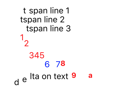
In addition to text drawn in a straight line, SVG also includes the ability to place text along the shape of a element. To specify that a block of text is to be rendered along the shape of a , include the given text within a element which includes an href attribute with a reference to a element.
<Svg height="100" width="200">
  <Defs>
    <Path id="path" d={path} />
  </Defs>
  <G y="20">
    <Text fill="blue">
      <TextPath href="#path" startOffset="-10%">
        We go up and down,
        <TSpan fill="red" dy="5,5,5">
          then up again
        </TSpan>
      </TextPath>
    </Text>
    <Path d={path} fill="none" stroke="red" strokeWidth="1" />
  </G>
</Svg>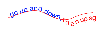
The element is a container used to group other SVG elements. Transformations applied to the g element are performed on all of its child elements, and any of its props are inherited by its child elements. It can also group multiple elements to be referenced later with the <Use /> element.
<Svg height="100" width="200">
  <G rotation="50" origin="100, 50">
    <Line x1="60" y1="10" x2="140" y2="10" stroke="#060" />

    <Rect x="60" y="20" height="50" width="80" stroke="#060" fill="#060" />

    <Text x="100" y="75" stroke="#600" fill="#600" textAnchor="middle">
      Text grouped with shapes
    </Text>
  </G>
</Svg>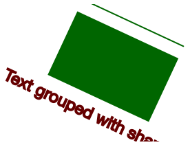
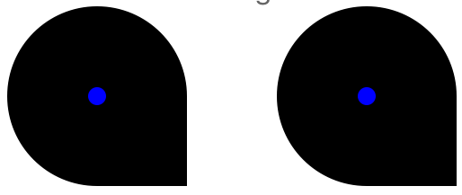
The element can reuse an SVG shape from elsewhere in the SVG document, including elements and elements. The reused shape can be defined inside the <Defs> element (which makes the shape invisible until used) or outside.
<Svg height="100" width="300">
  <Defs>
    <G id="shape">
      <G>
        <Circle cx="50" cy="50" r="50" />
        <Rect x="50" y="50" width="50" height="50" />
        <Circle cx="50" cy="50" r="5" fill="blue" />
      </G>
    </G>
  </Defs>
  <Use href="#shape" x="20" y="0" />
  <Use href="#shape" x="170" y="0" />
</Svg>
This example shows a element defined inside a <Defs> element. This makes the invisible unless referenced by a element.
Before the element can be referenced, it must have an ID set on it via its id prop. The element references the element via its href prop. Notice the # in front of the ID in the prop value.
The element specifies where to show the reused shapes via its x and y props. Notice that the shapes inside the element are located at 0,0. That is done because their position is added to the position specified in the element.
The SVG element is used to define reusable symbols. The shapes nested inside a are not displayed unless referenced by a element.
<Svg height="150" width="110">
  <Symbol id="symbol" viewBox="0 0 150 110" width="100" height="50">
    <Circle cx="50" cy="50" r="40" strokeWidth="8" stroke="red" fill="red" />
    <Circle
      cx="90"
      cy="60"
      r="40"
      strokeWidth="8"
      stroke="green"
      fill="white"
    />
  </Symbol>

  <Use href="#symbol" x="0" y="0" />
  <Use href="#symbol" x="0" y="50" width="75" height="38" />
  <Use href="#symbol" x="0" y="100" width="50" height="25" />
</Svg>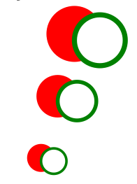
The element is used to embed definitions that can be reused inside an SVG image. For instance, you can group SVG shapes together and reuse them as a single shape.
The element allows a raster image to be included in an Svg component.
<Svg height="100" width="100">
  <Defs>
    <ClipPath id="clip">
      <Circle cx="50%" cy="50%" r="40%" />
    </ClipPath>
  </Defs>
  <Rect x="0" y="0" width="100%" height="100%" fill="red" />
  <Rect x="5%" y="5%" width="50%" height="90%" />

  <Image
    x="5%"
    y="5%"
    width="50%"
    height="90%"
    preserveAspectRatio="xMidYMid slice"
    opacity="0.5"
    href={require('../image.jpg')}
    clipPath="url(#clip)"
  />
  <Text
    x="50"
    y="50"
    textAnchor="middle"
    fontWeight="bold"
    fontSize="16"
    fill="blue">
    HOGWARTS
  </Text>
</Svg>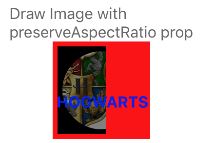
The SVG element defines a clipping path. A clipping path is used/referenced using the clipPath property
<Svg height="100" width="100">
  <Defs>
    <RadialGradient
      id="grad"
      cx="50%"
      cy="50%"
      rx="50%"
      ry="50%"
      fx="50%"
      fy="50%"
      gradientUnits="userSpaceOnUse">
      <Stop offset="0%" stopColor="#ff0" stopOpacity="1" />
      <Stop offset="100%" stopColor="#00f" stopOpacity="1" />
    </RadialGradient>
    <ClipPath id="clip">
      <G scale="0.9" x="10">
        <Circle cx="30" cy="30" r="20" />
        <Ellipse cx="60" cy="70" rx="20" ry="10" />
        <Rect x="65" y="15" width="30" height="30" />
        <Polygon points="20,60 20,80 50,70" />
        <Text
          x="50"
          y="30"
          fontSize="32"
          fontWeight="bold"
          textAnchor="middle"
          scale="1.2">
          Q
        </Text>
      </G>
    </ClipPath>
  </Defs>
  <Rect
    x="0"
    y="0"
    width="100"
    height="100"
    fill="url(#grad)"
    clipPath="url(#clip)"
  />
</Svg>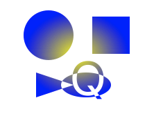
The element is used to define a linear gradient. The element must be nested within a <Defs> tag. The <Defs> tag is short for definitions and contains definition of special elements (such as gradients).
Linear gradients can be defined as horizontal, vertical or angular gradients:
- Horizontal gradients are created when y1 and y2 are equal and x1 and x2 differ
- Vertical gradients are created when x1 and x2 are equal and y1 and y2 differ
- Angular gradients are created when x1 and x2 differ and y1 and y2 differ
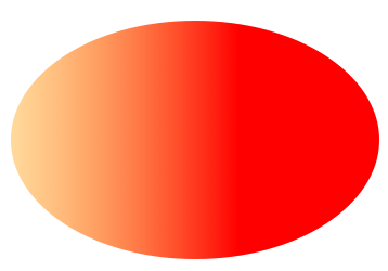
<Svg height="150" width="300">
  <Defs>
    <LinearGradient id="grad" x1="0" y1="0" x2="1" y2="0">
      <Stop offset="0" stopColor="#FFD080" stopOpacity="1" />
      <Stop offset="1" stopColor="red" stopOpacity="1" />
    </LinearGradient>
  </Defs>
  <Ellipse cx="150" cy="75" rx="85" ry="55" fill="url(#grad)" />
</Svg>
Code explanation:
- The id prop of the tag defines a unique name for the gradient
- The x1, x2, y1,y2 props of the tag define the start and end position of the gradient
- The color range for a gradient can be composed of two or more colors. Each color is specified with a tag. The offset prop is used to define where the gradient color begin and end
- The fill prop links the ellipse element to the gradient
NOTICE: LinearGradient also supports percentage as prop:
<LinearGradient id="grad" x1="0%" y1="0%" x2="100%" y2="0%">
  <Stop offset="0%" stopColor="rgb(255,255,0)" stopOpacity="0" />
  <Stop offset="100%" stopColor="red" stopOpacity="1" />
</LinearGradient>
This result is same as the example before. But it's recommend to use exact number instead; it has performance advantages over using percentages.
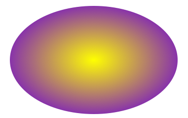
The element is used to define a radial gradient. The element must be nested within a <Defs> tag. The <Defs> tag is short for definitions and contains definition of special elements (such as gradients).
<Svg height="150" width="300">
  <Defs>
    <RadialGradient
      id="grad"
      cx="150"
      cy="75"
      rx="85"
      ry="55"
      fx="150"
      fy="75"
      gradientUnits="userSpaceOnUse">
      <Stop offset="0" stopColor="#ff0" stopOpacity="1" />
      <Stop offset="1" stopColor="#83a" stopOpacity="1" />
    </RadialGradient>
  </Defs>
  <Ellipse cx="150" cy="75" rx="85" ry="55" fill="url(#grad)" />
</Svg>
Code explanation:
- The id prop of the tag defines a unique name for the gradient
- The cx, cy and r props define the outermost circle and the fx and fy define the innermost circle
- The color range for a gradient can be composed of two or more colors. Each color is specified with a tag. The offset prop is used to define where the gradient color begin and end
- The fill prop links the ellipse element to the gradient
In SVG, you can specify that any other graphics object or ‘G’ element can be used as an alpha mask for compositing the current object into the background.
A mask is defined with a ‘Mask’ element. A mask is used/referenced using the ‘mask’ property.
A ‘Mask’ can contain any graphical elements or container elements such as a ‘G’.
The element must be nested within a <Defs> tag. The <Defs> tag is short for definitions and contains definition of special elements (such as gradients).
https://www.w3.org/TR/SVG11/images/masking/mask01.svg
<Svg width="100%" height="100%" viewBox="0 0 800 300">
  <Defs>
    <LinearGradient
      id="Gradient"
      gradientUnits="userSpaceOnUse"
      x1="0"
      y1="0"
      x2="800"
      y2="0">
      <Stop offset="0" stopColor="white" stopOpacity="0" />
      <Stop offset="1" stopColor="white" stopOpacity="1" />
    </LinearGradient>
    <Mask
      id="Mask"
      maskUnits="userSpaceOnUse"
      x="0"
      y="0"
      width="800"
      height="300">
      <Rect x="0" y="0" width="800" height="300" fill="url(#Gradient)" />
    </Mask>
    <Text
      id="Text"
      x="400"
      y="200"
      fontFamily="Verdana"
      fontSize="100"
      textAnchor="middle">
      Masked text
    </Text>
  </Defs>
  <Rect x="0" y="0" width="800" height="300" fill="#FF8080" />
  <Use href="#Text" fill="blue" mask="url(#Mask)" />
  <Use href="#Text" fill="none" stroke="black" stroke-width="2" />
</Svg>
Code explanation: https://www.w3.org/TR/SVG11/masking.html#MaskElement

v10 adds experimental support for using masks together with native elements. If you had native elements inside any Svg root before (which was unsupported), then your content might change appearance when upgrading, as e.g. transforms and masks now take effect.
A pattern is used to fill or stroke an object using a pre-defined graphic object which can be replicated ("tiled") at fixed intervals in x and y to cover the areas to be painted. Patterns are defined using a ‘pattern’ element and then referenced by properties ‘fill’ and ‘stroke’ on a given graphics element to indicate that the given element shall be filled or stroked with the referenced pattern. The element must be nested within a <Defs> tag. The <Defs> tag is short for definitions and contains definition of special elements (such as gradients).
https://www.w3.org/TR/SVG11/images/pservers/pattern01.svg
<Svg width="100%" height="100%" viewBox="0 0 800 400">
  <Defs>
    <Pattern
      id="TrianglePattern"
      patternUnits="userSpaceOnUse"
      x="0"
      y="0"
      width="100"
      height="100"
      viewBox="0 0 10 10">
      <Path d="M 0 0 L 7 0 L 3.5 7 z" fill="red" stroke="blue" />
    </Pattern>
  </Defs>
  <Rect fill="none" stroke="blue" x="1" y="1" width="798" height="398" />
  <Ellipse
    fill="url(#TrianglePattern)"
    stroke="black"
    strokeWidth="5"
    cx="400"
    cy="200"
    rx="350"
    ry="150"
  />
</Svg>
Code explanation: https://www.w3.org/TR/SVG11/pservers.html#PatternElement

A marker is a symbol which is attached to one or more vertices of ‘path’, ‘line’, ‘polyline’ and ‘polygon’ elements. Typically, markers are used to make arrowheads or polymarkers. Arrowheads can be defined by attaching a marker to the start or end vertices of ‘path’, ‘line’ or ‘polyline’ elements. Polymarkers can be defined by attaching a marker to all vertices of a ‘path’, ‘line’, ‘polyline’ or ‘polygon’ element.
The graphics for a marker are defined by a ‘marker’ element. To indicate that a particular ‘marker’ element should be rendered at the vertices of a particular ‘path’, ‘line’, ‘polyline’ or ‘polygon’ element, set one or more marker properties (‘marker’, ‘marker-start’, ‘marker-mid’ or ‘marker-end’) to reference the given ‘marker’ element.
https://www.w3.org/TR/SVG11/images/painting/marker.svg
<Svg width="400" height="200" viewBox="0 0 4000 2000">
  <Defs>
    <Marker
      id="Triangle"
      viewBox="0 0 10 10"
      refX="0"
      refY="5"
      markerUnits="strokeWidth"
      markerWidth="4"
      markerHeight="3"
      orient="auto">
      <Path d="M 0 0 L 10 5 L 0 10 z" />
    </Marker>
  </Defs>
  <Rect
    x="10"
    y="10"
    width="3980"
    height="1980"
    fill="none"
    stroke="blue"
    strokeWidth="10"
  />
  <Path
    d="M 1000 750 L 2000 750 L 2500 1250"
    fill="none"
    stroke="black"
    strokeWidth="100"
    markerEnd="url(#Triangle)"
  />
</Svg>
Code explanation: https://www.w3.org/TR/SVG11/painting.html#Markers

import React from 'react';
import { StyleSheet, View } from 'react-native';
import { SvgXml } from 'react-native-svg';

const markerRendering = `<svg xmlns="http://www.w3.org/2000/svg"
     width="275" height="200" viewBox="0 0 100 30">
  <defs>
    <marker id="m1" viewBox="0 0 10 10" refX="5" refY="5"
     markerWidth="8" markerHeight="8">
      <circle cx="5" cy="5" r="5" fill="green"/>
    </marker>
    <marker id="m2" viewBox="0 0 10 10" refX="5" refY="5"
     markerWidth="6.5" markerHeight="6.5">
      <circle cx="5" cy="5" r="5" fill="skyblue" opacity="0.9"/>
    </marker>
    <marker id="m3" viewBox="0 0 10 10" refX="5" refY="5"
     markerWidth="5" markerHeight="5">
      <circle cx="5" cy="5" r="5" fill="maroon" opacity="0.85"/>
    </marker>
  </defs>

  <path d="M10,10 h10 v10 z m20,0 h10 v10 z m20,0 h10 v10 z"
  fill="none" stroke="black"
  marker-start="url(#m1)"
  marker-mid="url(#m2)"
  marker-end="url(#m3)"
  />
</svg>`;

export default class App extends React.Component {
  render() {
    return (
      <View style={styles.container}>
        <SvgXml xml={markerRendering} />
      </View>
    );
  }
}

const styles = StyleSheet.create({
  container: {
    backgroundColor: 'white',
    justifyContent: 'center',
    alignItems: 'center',
    flex: 1,
  },
});
import React from 'react';
import { StyleSheet, View } from 'react-native';
import { SvgXml } from 'react-native-svg';

const markerRendering = `<svg xmlns="http://www.w3.org/2000/svg"
     width="275" height="200" viewBox="0 0 275 200">
  <defs>
    <marker id="Triangle" viewBox="0 0 10 10" refX="1" refY="5"
            markerUnits="strokeWidth" markerWidth="4" markerHeight="3"
            orient="auto">
      <path d="M 0 0 L 10 5 L 0 10 z" fill="context-stroke" />
    </marker>
  </defs>

  <g fill="none" stroke-width="10" marker-end="url(#Triangle)">
    <path stroke="crimson" d="M 100,75 C 125,50 150,50 175,75" marker-end="url(#Triangle)"/>
    <path stroke="olivedrab" d="M 175,125 C 150,150 125,150 100,125" marker-end="url(#Triangle)"/>
  </g>
</svg>`;

export default class App extends React.Component {
  render() {
    return (
      <View style={styles.container}>
        <SvgXml xml={markerRendering} />
      </View>
    );
  }
}

const styles = StyleSheet.create({
  container: {
    backgroundColor: 'white',
    justifyContent: 'center',
    alignItems: 'center',
    flex: 1,
  },
});
Code explanation: https://www.w3.org/TR/SVG2/painting.html#VertexMarkerProperties
SVG is designed to be compatible with other XML languages for describing and rendering other types of content. The ‘foreignObject’ element allows for inclusion of elements in a non-SVG namespace which is rendered within a region of the SVG graphic using other user agent processes. The included foreign graphical content is subject to SVG transformations, filters, clipping, masking and compositing.
One goal for SVG is to provide a mechanism by which other XML language processors can render into an area within an SVG drawing, with those renderings subject to the various transformations and compositing parameters that are currently active at a given point within the SVG content tree. One particular example of this is to provide a frame for XML content styled with CSS or XSL so that dynamically reflowing text (subject to SVG transformations and compositing) could be inserted into the middle of some SVG content.
https://svgwg.org/svg2-draft/embedded.html#ForeignObjectElement https://www.w3.org/TR/SVG11/extend.html#ForeignObjectElement
import React, { Component } from 'react';
import { Text, View, Image } from 'react-native';
import {
  Svg,
  Defs,
  LinearGradient,
  Stop,
  Mask,
  Rect,
  G,
  Circle,
  ForeignObject,
} from 'react-native-svg';

export default class App extends Component {
  render() {
    return (
      <View style={{ flex: 1, justifyContent: 'center' }}>
        <Svg height="50%">
          <Defs>
            <LinearGradient
              id="Gradient"
              gradientUnits="userSpaceOnUse"
              x1="0"
              y1="0"
              x2="800"
              y2="0">
              <Stop offset="0" stopColor="white" stopOpacity="0.2" />
              <Stop offset="1" stopColor="white" stopOpacity="1" />
            </LinearGradient>
            <Mask
              id="Mask"
              maskUnits="userSpaceOnUse"
              x="0"
              y="0"
              width="800"
              height="300">
              <Rect
                x="0"
                y="0"
                width="800"
                height="300"
                fill="url(#Gradient)"
              />
            </Mask>
          </Defs>
          <G mask="url(#Mask)">
            <Circle cx={50} cy={70} r={65} />
            <ForeignObject x={50} y={0} width={100} height={100}>
              <View style={{ width: 200, height: 400, transform: [] }}>
                <Image
                  style={{ width: 200, height: 200 }}
                  source={{
                    uri: 'https://picsum.photos/200/200',
                  }}
                />
              </View>
            </ForeignObject>
            <ForeignObject x={55} y={5} width={100} height={100}>
              <View style={{ width: 200, height: 400, transform: [] }}>
                <Text style={{ color: 'blue' }}>Testing</Text>
                <Text style={{ color: 'green' }}>Testing2</Text>
              </View>
            </ForeignObject>
          </G>
        </Svg>
      </View>
    );
  }
}
Touch events are supported in react-native-svg. These include:
disabledonPressonPressInonPressOutonLongPressdelayPressIndelayPressOutdelayLongPress
You can use these events to provide interactivity to your react-native-svg components.
<Circle
  cx="50%"
  cy="50%"
  r="38%"
  fill="red"
  onPress={() => alert('Press on Circle')}
/>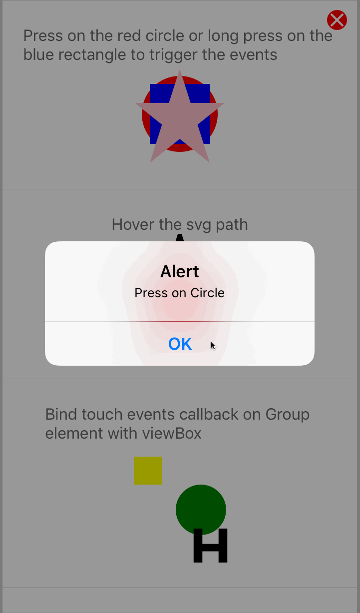
For more examples of touch in action, checkout the TouchEvents.js examples.
import * as React from 'react';
import { Platform, StyleSheet, TouchableOpacity } from 'react-native';
import { Svg, Rect } from 'react-native-svg';
import ReactDOMServer from 'react-dom/server';

const isWeb = Platform.OS === 'web';

const childToWeb = (child) => {
  const { type, props } = child;
  const name = type && type.displayName;
  const webName = name && name[0].toLowerCase() + name.slice(1);
  const Tag = webName ? webName : type;
  return <Tag {...props}>{toWeb(props.children)}</Tag>;
};

const toWeb = (children) => React.Children.map(children, childToWeb);

export default class App extends React.Component {
  renderSvg() {
    return (
      <Svg height="100%" width="100%" style={{ backgroundColor: '#33AAFF' }}>
        <Rect
          x="50"
          y="50"
          width="50"
          height="50"
          fill="#3399ff"
          strokeWidth="3"
          stroke="rgb(0,0,0)"
        />
      </Svg>
    );
  }
  serialize = () => {
    const element = this.renderSvg();
    const webJsx = isWeb ? element : toWeb(element);
    const svgString = ReactDOMServer.renderToStaticMarkup(webJsx);
    console.log(svgString);
  };
  render() {
    return (
      <TouchableOpacity style={styles.container} onPress={this.serialize}>
        {this.renderSvg()}
      </TouchableOpacity>
    );
  }
}

const styles = StyleSheet.create({
  container: {
    flex: 1,
    justifyContent: 'center',
    backgroundColor: '#ecf0f1',
    padding: 8,
  },
});Filter effects are a way of processing an element’s rendering before it is displayed in the document. Typically, rendering an element via CSS or SVG can conceptually be described as if the element, including its children, are drawn into a buffer (such as a raster image) and then that buffer is composited into the elements parent. Filters apply an effect before the compositing stage. Examples of such effects are blurring, changing color intensity and warping the image.
Note
Not all filters have been implemented on native platforms yet. However, they do work on the Web, so we added them. Some filters will display a warning indicating they are not currently supported.
The following filters have been implemented:
- FeColorMatrix
- FeGaussianBlur
- FeMerge
- FeOffset
Not supported yet:
- FeBlend
- FeComponentTransfer
- FeComposite
- FeConvolveMatrix
- FeDiffuseLighting
- FeDisplacementMap
- FeDropShadow
- FeFlood
- FeFuncA
- FeFuncB
- FeFuncG
- FeFuncR
- FeImage
- FeMorphology
- FePointLight
- FeSpecularLighting
- FeSpotLight
- FeTile
- FeTurbulence
Exmaple use of filters:
import React from 'react';
import { FeColorMatrix, Filter, Rect, Svg } from 'react-native-svg';

export default () => {
  return (
    <Svg height="300" width="300">
      <Filter id="myFilter">
        <FeColorMatrix type="saturate" values="0.2" />
      </Filter>
      <Rect
        x="0"
        y="0"
        width="300"
        height="300"
        fill="red"
        filter="url(#myFilter)"
      />
    </Svg>
  );
};
More info: https://www.w3.org/TR/SVG11/filters.html
FilterImage is a new component that is not strictly related to SVG. Its behavior should be the same as a regular Image component from React Native with one exception - the additional prop filters, which accepts an array of filters to apply to the image.
Filters can be applied in two ways
- through
filtersprop - or with CSS API through style prop https://developer.mozilla.org/en-US/docs/Web/CSS/filter
import React from 'react';
import { StyleSheet } from 'react-native';
import { FilterImage } from 'react-native-svg/filter-image';

const myImage = require('./myImage.jpg');

export default () => {
  return <FilterImage style={styles.image} source={myImage} />;
};

const styles = StyleSheet.create({
  image: {
    width: 200,
    height: 200,
    filter: 'saturate(3) grayscale(100%)',
  },
});import React from 'react';
import { StyleSheet } from 'react-native';
import { FilterImage } from 'react-native-svg/filter-image';
const myImage = require('./myImage.jpg');
export default () => {
return (
<FilterImage
style={styles.image}
source={myImage}
filters={[
{ name: 'feColorMatrix', type: 'saturate', values: 0.2 },
{
name: 'feColorMatrix',
type: 'matrix',
values: [
0.2, 0.2, 0.2, 0, 0, 0.2, 0.2, 0.2, 0, 0, 0.2, 0.2, 0.2, 0, 0, 0, 0,
0, 1, 0,
],
},
]}
/>
);
};
const styles = StyleSheet.create({
image: {
width: 200,
height: 200,
},
});